Overview
Island Gurl is a conceptual skincare and haircare brand created for Black women living along the Caribbean coasts of Central America. The project celebrates natural beauty, cultural heritage, and self-confidence through a vibrant visual identity inspired by island landscapes, tropical botanicals, and melanin-rich skin.
The goal was to create a premium lifestyle brand that feels authentic to the communities it represents while standing confidently beside established beauty brands on retail shelves. Every design decision, from the warm color palette and custom illustrations to the packaging system and marketing materials, was developed to evoke feelings of warmth, nourishment, and pride.
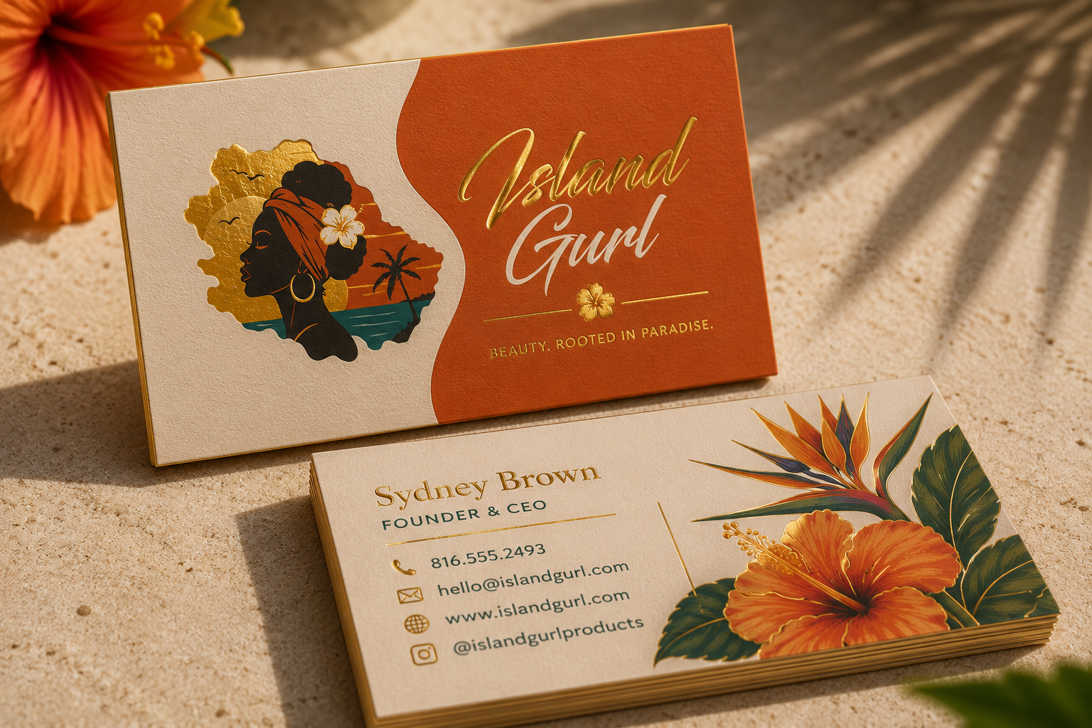
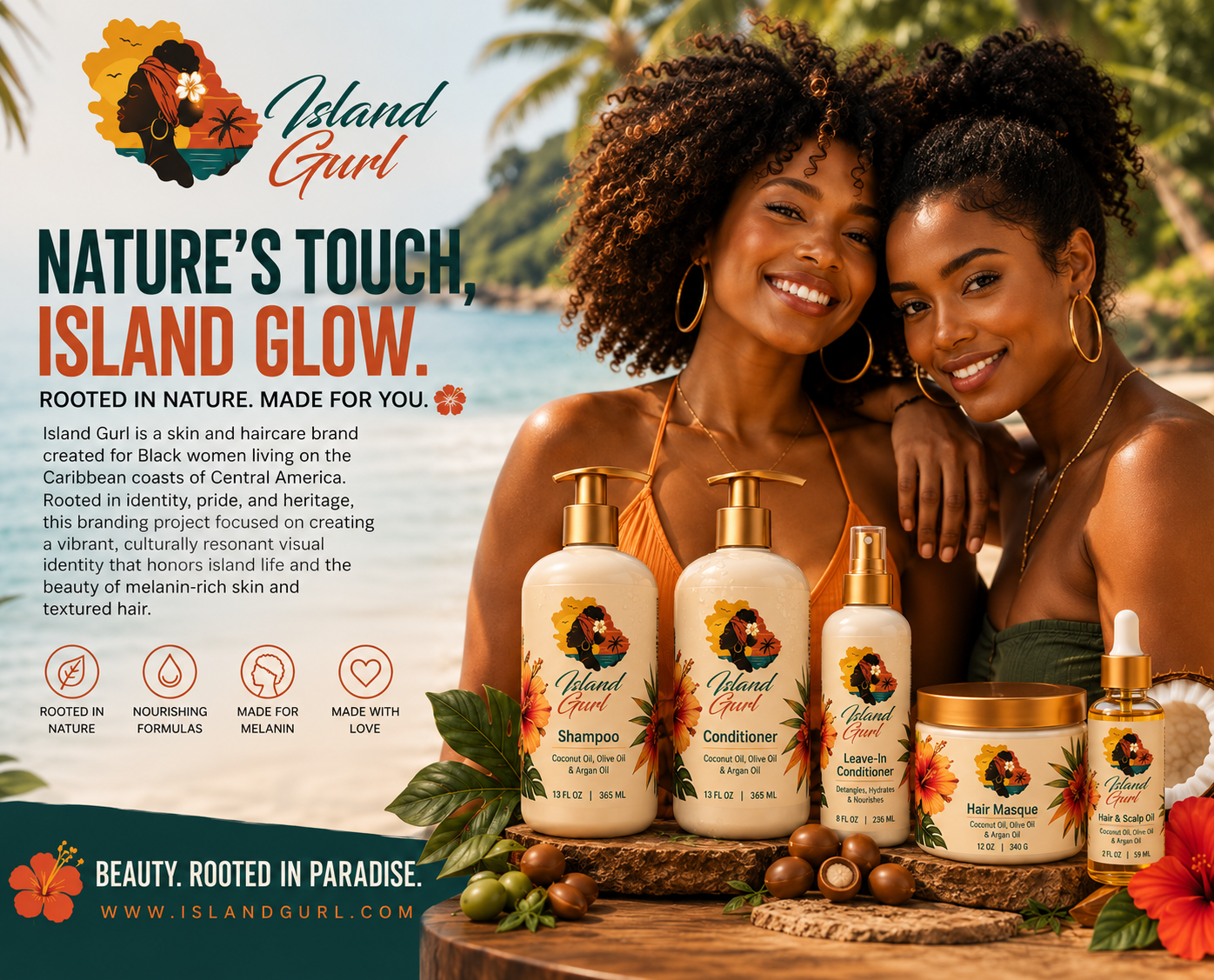
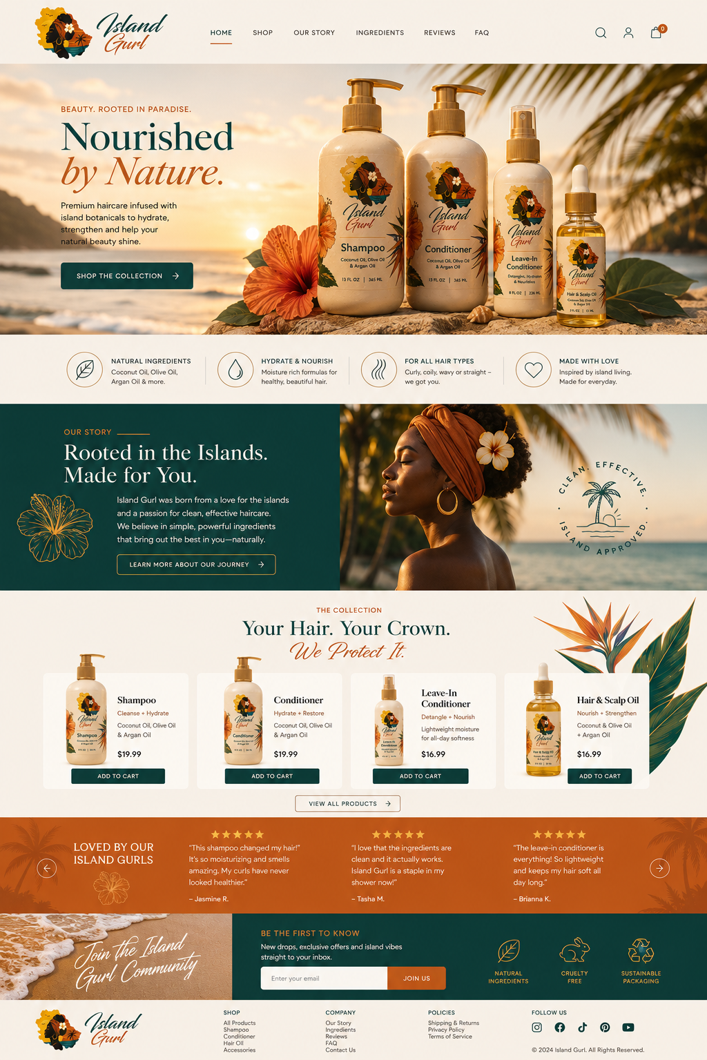
The project extends beyond logo design into a complete brand ecosystem, including product packaging, advertising campaigns, retail mockups, stationery, website design, social media assets, and environmental branding. Together, these elements demonstrate how a cohesive visual identity can create an immersive customer experience across both digital and physical touch points.
By combining culturally inspired storytelling with modern branding principles, Island Gurl positions itself as more than a beauty brand. It becomes a celebration of heritage, identity, and the natural beauty of island life.
Brand Attributes:
Natural
Feminine
Tropical
Authentic
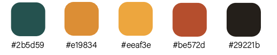
Color Palette
Typography
Blacksword
Myriad Pro
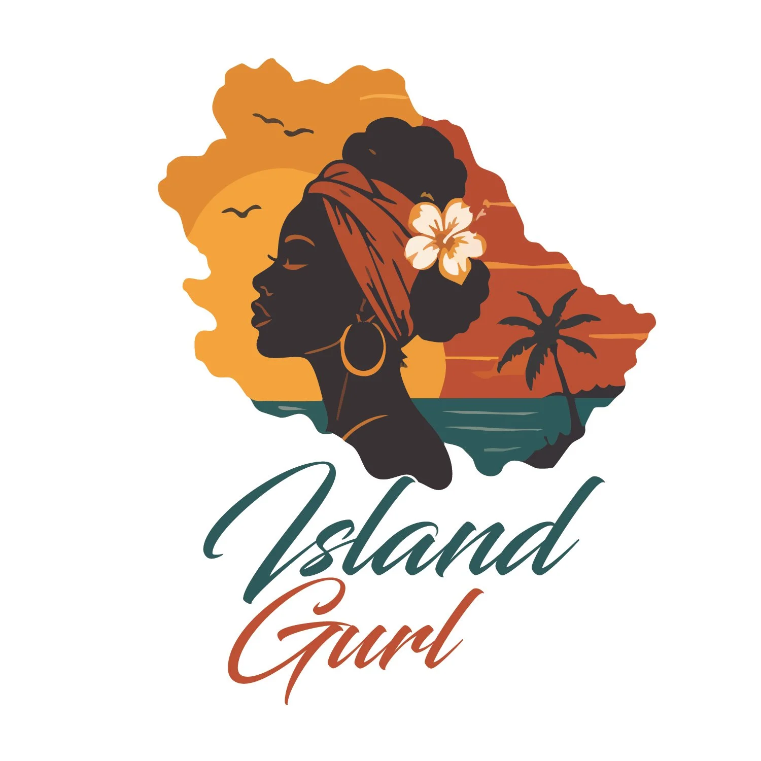
Primary Logo
Wordmark
Empowering Packaging
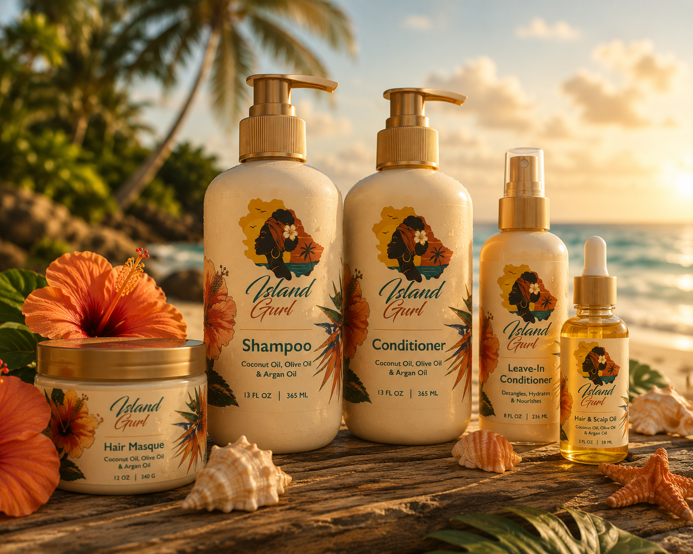
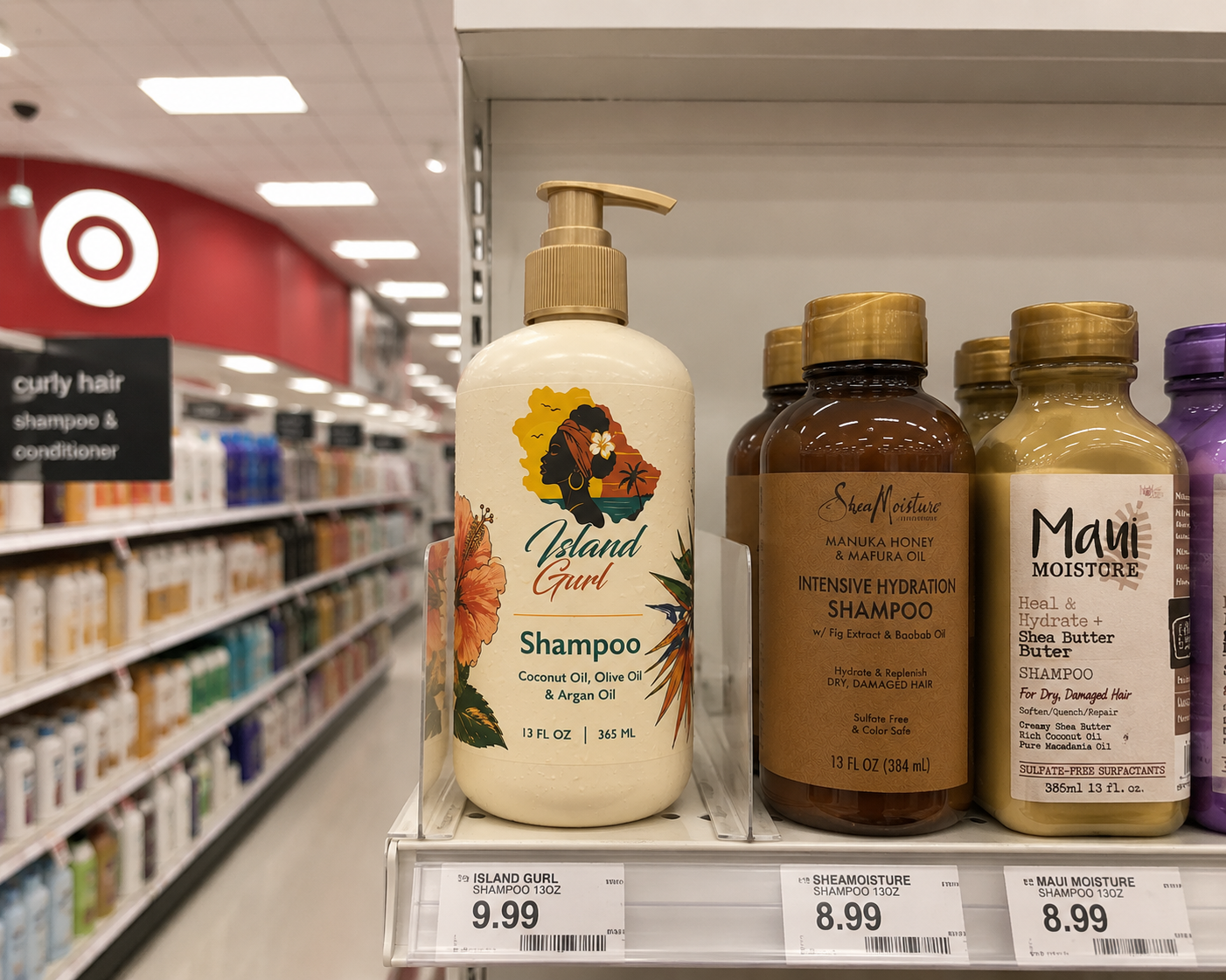
The Island Gurl packaging system was designed to reflect the warmth, vibrancy, and cultural richness of the Caribbean while creating a premium retail experience. Inspired by tropical landscapes, native botanicals, and the beauty of melanin-rich skin, each package balances bold visual storytelling with clean, modern design principles.
The packaging uses a cohesive system of warm sunset tones, ocean-inspired blues, and botanical illustrations to create instant brand recognition across every product. A consistent layout, custom branding elements, and nature-inspired graphics allow the shampoo, conditioner, hair oil, body butter, and styling products to feel unified while maintaining clear product differentiation.
Beyond aesthetics, the packaging was created with retail in mind. Labels emphasize readability, hierarchy, and shelf impact, ensuring products remain visually striking from a distance while communicating key product benefits at a glance. The result is a packaging system that feels authentic, inviting, and competitive alongside established beauty brands.
The final collection demonstrates how thoughtful packaging design can strengthen brand identity, communicate product quality, and create an emotional connection with consumers through consistent visual language.